


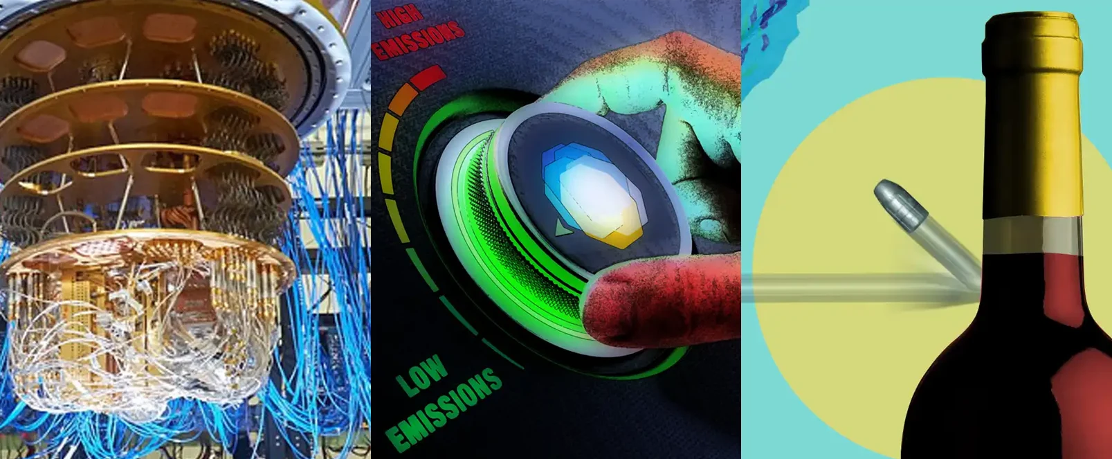


A Programmer’s Introduction to Processing Imaging Radar Data

Written by Dr Matthew Roberts
Lead Consultant
A Programmer’s Introduction to Processing Imaging Radar Data
I started working on my first radar in 2017. I was tasked to develop the data capture and processing parts of the radar system ready for demonstration at a large exhibition.
The demonstrator radar system was going to run for the entire time the exhibition was open, i.e. five long days. It needed to provide a live feed, not crash, and be developed on a tight budget. The aim was to help attract people to our stand and to demonstrate the highly capable and small radar front-end that had been developed by my colleagues. I’m happy to say that the demonstration system worked. It became a foundation for a variety of projects and some of the code base is still in use.
When talking with project partners, clients, and prospective clients, I’ve often been asked about the data that our radar systems provide and how they work. I thought I would use some spare time to write this page in the hope that it might be useful in providing some answers. I’m going to attempt to explain the data processing pipeline for one of our radars – a millimetre-wave frequency scanning imaging radar. I think this particular radar is a good example because: we’ve supplied units to multiple organisations; our latest millimetre-wave radar is an evolution of it; and it is very similar to the original demonstrator radar system.
I am not going to provide a theoretical introduction to radar. Whilst it would be helpful, I am not the right person to provide this, and I don’t think it is necessary if you are a software developer and you want to better understand the system in order to interface with it. Instead, I’m going to provide example Python code that uses the NumPy and Matplotlib libraries.
The Radar
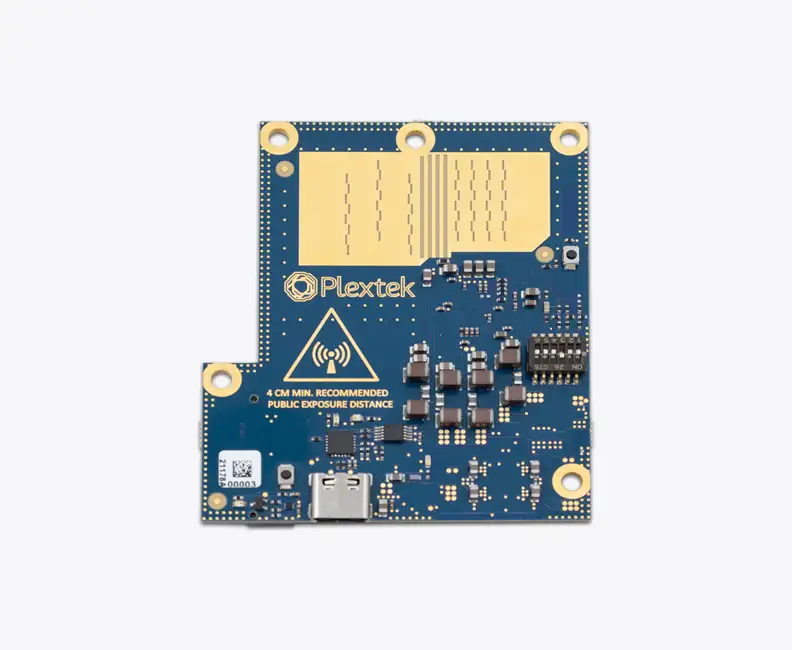
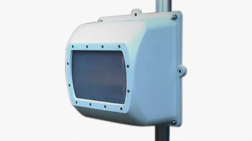
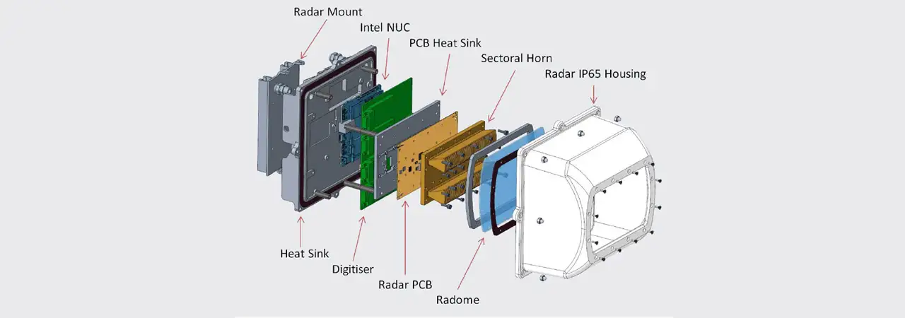
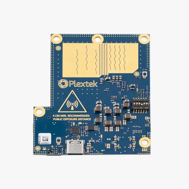
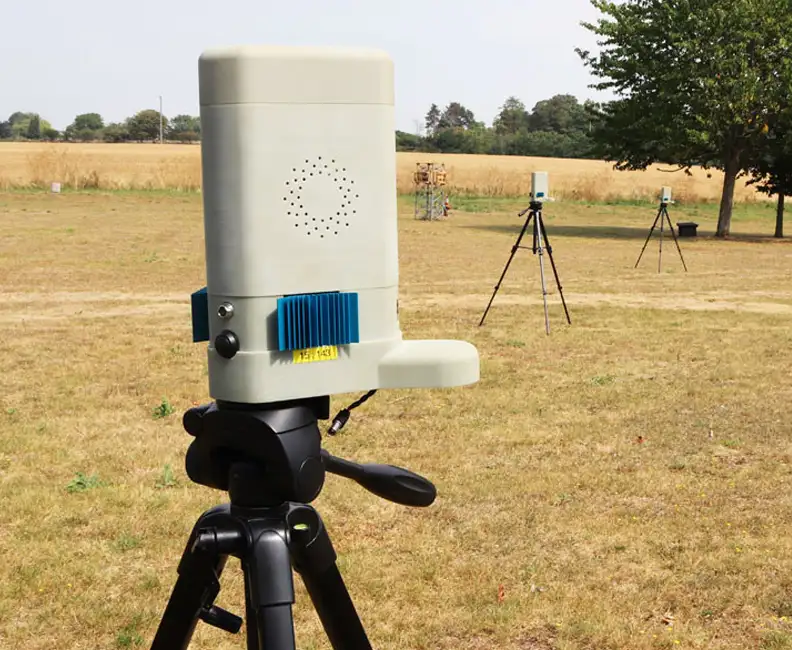
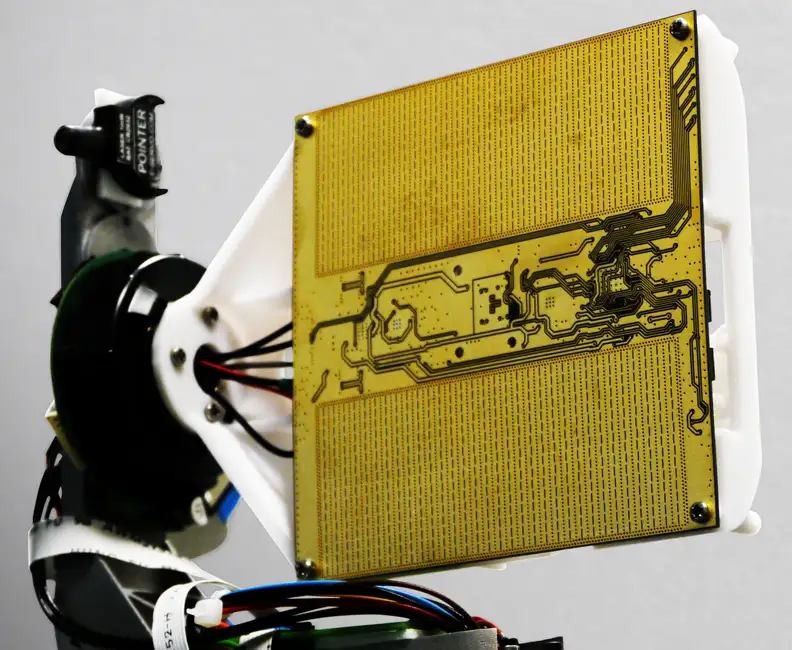
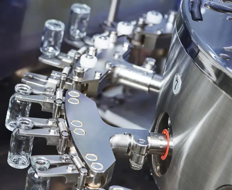
Plextek’s Millimetre-Wave Radar Demonstrator (see image below), not to be confused with our early demonstration radar system that we took to the previously mentioned exhibition, is an electronically scanned Frequency Modulated Continuous-Wave (FMCW) radar that operates in the 60 GHz license-exempt band.
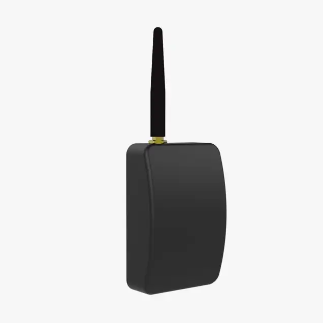
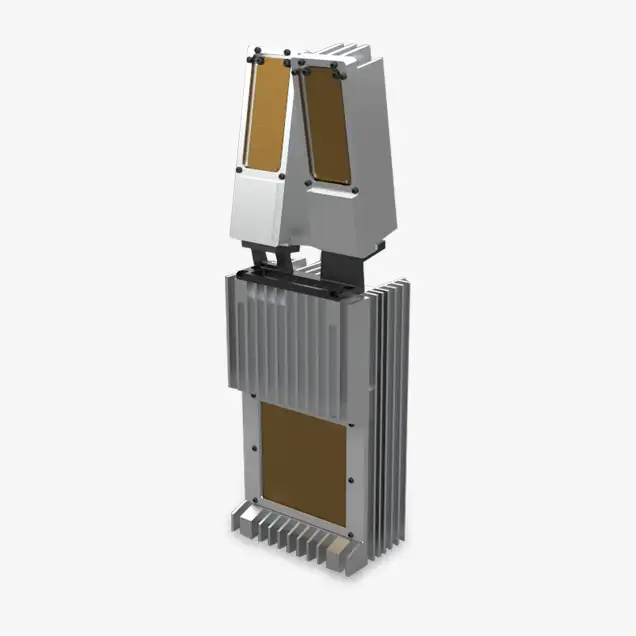
The radar consists of a computer, a digitiser, a radio frequency (RF) front-end, and a waveguide horn antenna housed within an IP65 enclosure that includes a radome and heatsink. The RF front-end contains all of the RF electronics, this part synthesises the millimetre-wave signal, which it transmits and uses to demodulate the received signal, before driving the digitiser. The RF front-end is a printed circuit board that includes a feed into the sectoral horn antenna, which reduces the field of view in the vertical plane whilst increasing its gain. The computer is connected to a digitiser and performs the data processing.
The antenna, developed by my colleagues, shifts its peak gain (its main lobe) as the frequency of the transmitted waveform changes. This allows the radar to scan a field of view quickly and without the need for moving parts.
A traditional pulsed radar transmits a short burst of signal and then turns the transmitter off whilst it listens for reflections from objects. The range to an object is determined using (half) the time between the transmitted and received pulses. An FMCW radar continuously transmits a modulated signal whilst simultaneously receiving. The transmitted signal is mixed with the received signal, producing a tone for each reflection. The frequency of each tone is proportional to the range to the target that produced the reflection. The output from the front-end of the radar contains a set of these tones.
Please accept cookies in order to enable video functionality.
This video provides an example radar output, where a single visualisation is shown alongside the feed from a co-located video camera.
Processing
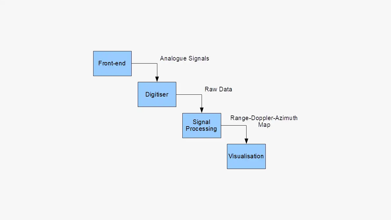
Hopefully what you’ve read so far has provided some useful background information. In the remainder of this blog, I’m going to attempt to explain how we can take raw data from the digitiser and convert it into visualisations that bear some resemblance to a photo of the scene.
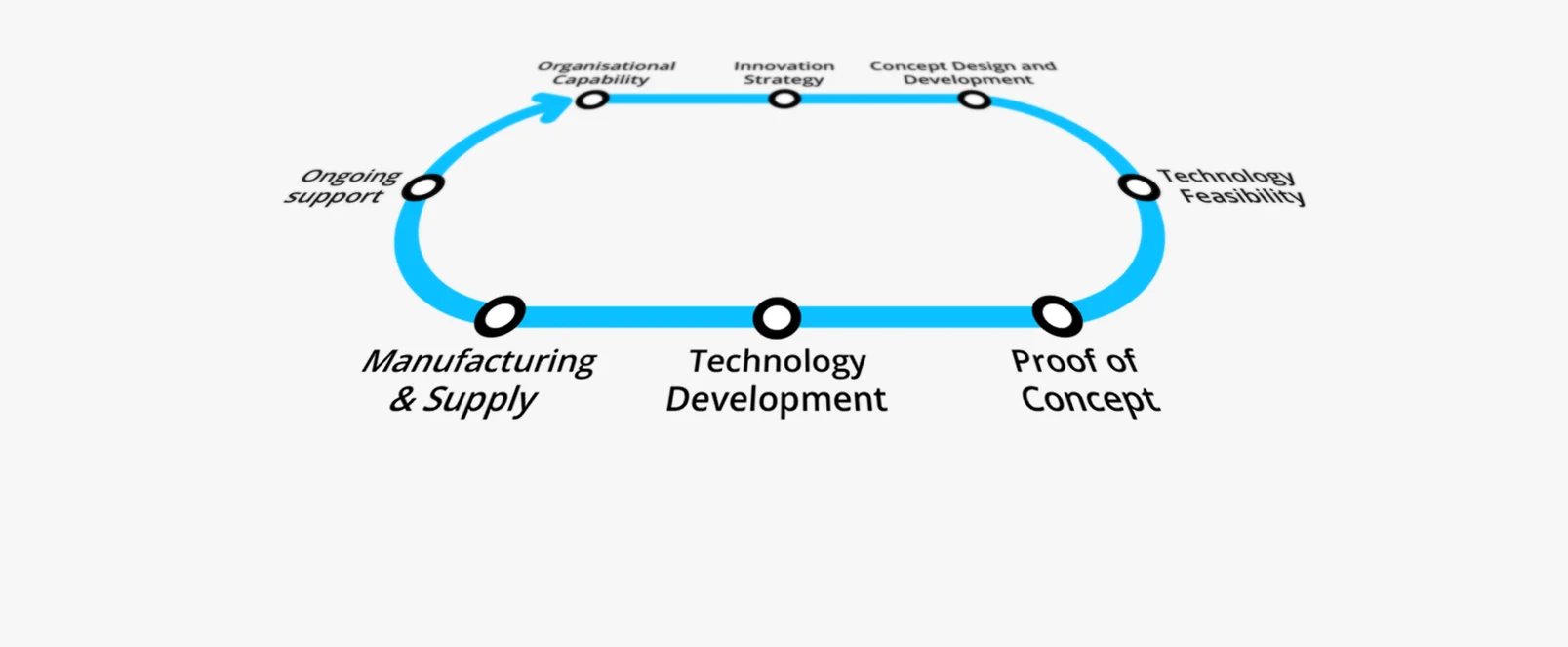
This flow chart provides a high-level overview of the steps. We are going to start by looking at some example raw data, then by performing processing that is common to all the visualisations used here, and then finally we are going to look at some visualisations.
Raw Data
As previously mentioned, the radar continuously (and simultaneously) transmits and receives. It transmits a periodic waveform, where one period is referred to as a Ramp Repetition Interval (RRI). The waveform starts by resetting the transmit frequency back to the starting (lowest) frequency, in the down-ramp. The up-ramp is then the majority of the RRI; it is where the varying frequency is used to electronically scan the radar, from left to right.
The digitiser uses a trigger to align its captures with the RRIs; a capture always starts at the start of a down-ramp. In a single contiguous capture, we obtain enough samples for ND RRIs, where ND is the number of Doppler bins (I’ll explain these later). I’m going to refer to this capture as a ‘frame’ of raw data.
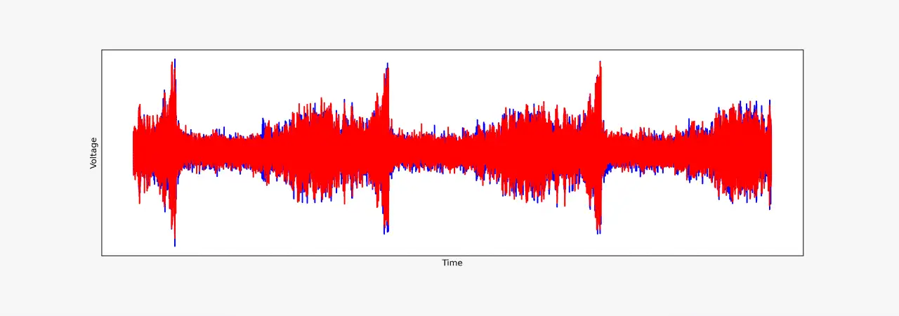
The Python code below loads a single frame of raw data and plots both the raw data for the first three RRIs and an approximation of the transmitted waveform for those RRIs. The frame of data was obtained from a radar mounted on a building at Plextek, the same radar that was used to produce the earlier video.
from matplotlib import patches
import matplotlib.pyplot as plt
import numpy as np

# Load raw data (a 1D complex array).
raw_data = np.load("raw_data.npy")
NUM_UP_RAMP_SAMPLES = 10000
NUM_DOWN_RAMP_SAMPLES = 2500
NUM_SAMPLES_PER_RAMP = NUM_UP_RAMP_SAMPLES + NUM_DOWN_RAMP_SAMPLES

# Plot raw time series data and the transmitted waveform.
fig, axes = plt.subplots(2, 1, sharex=<span style="color: #339966;"><span style="color: #339966;">True</span></span>)

# Plot both real (blue) and imaginary (red) components of
# the raw data.
real_raw_data = np.real(raw_data)
imag_raw_data = np.imag(raw_data)
# Plot the data that corresponds with the first 3 ramps.
NUM_RAMPS_TO_PLOT = 3
NUM_SAMPLES_TO_PLOT = NUM_RAMPS_TO_PLOT * NUM_SAMPLES_PER_RAMP
axes[0].plot(real_raw_data[0:NUM_SAMPLES_TO_PLOT], 'b')
axes[0].plot(imag_raw_data[0:NUM_SAMPLES_TO_PLOT], 'r')
axes[0].set_title("Raw Radar Output (to Digitiser)")
axes[0].set_xlabel("Time")
axes[0].set_ylabel("Voltage")
axes[0].get_xaxis().set_ticks([])
axes[0].get_yaxis().set_ticks([])

# Plot the transmit waveform.
# The actual frequencies aren't important.
START_FREQ = 0
END_FREQ = 1
# Each ramp repetition interval consists of a decreasing and then
# increasing frequency.
down_ramp = np.linspace(END_FREQ, START_FREQ, NUM_DOWN_RAMP_SAMPLES)
up_ramp = np.linspace(START_FREQ, END_FREQ, NUM_UP_RAMP_SAMPLES)
waveform_ramp = np.concatenate([down_ramp, up_ramp])
waveform_data = np.tile(waveform_ramp, NUM_RAMPS_TO_PLOT)
axes[1].plot(waveform_data)
axes[1].set_title("Transmitted Waveform (Approximation)")
axes[1].set_xlabel("Time")
axes[1].set_ylabel("Frequency")
axes[1].get_xaxis().set_ticks([])
axes[1].get_yaxis().set_ticks([])

# Add annotations to clarify the start and end of a RRI.
arrow_props = {'facecolor': "black", 'shrink': 0.1}
axes[1].annotate(
    "Start of first RRI",
    xy=(0, END_FREQ),
    xytext=(NUM_SAMPLES_PER_RAMP * 0.1, 0.9 * END_FREQ),
    arrowprops=arrow_props,
)
axes[1].annotate(
    "End of first RRI",
    xy=(NUM_SAMPLES_PER_RAMP, END_FREQ),
    xytext=(NUM_SAMPLES_PER_RAMP * 1.1, 0.9 * END_FREQ),
    arrowprops=arrow_props,
)

# Add annotations to show the scan direction.
arrow = patches.FancyArrowPatch(
    (NUM_DOWN_RAMP_SAMPLES, 0.5),
    (NUM_SAMPLES_PER_RAMP, 0.5),
    arrowstyle="|-|",
    mutation_scale=10,
    shrinkA=0,
    shrinkB=0,
)
axes[1].add_artist(arrow)
axes[1].text(4500, 0.4, "Scan from left to right")
arrow2 = patches.FancyArrowPatch(
    (NUM_SAMPLES_PER_RAMP, 0.5),
    (NUM_SAMPLES_PER_RAMP + NUM_DOWN_RAMP_SAMPLES, 0.5),
    arrowstyle="|-|",
    mutation_scale=10,
    shrinkA=0,
    shrinkB=0,
)
axes[1].add_artist(arrow2)
axes[1].text(NUM_SAMPLES_PER_RAMP, 0.4, "Reset scan")

# Improve spacing of plots.
fig.tight_layout()
Raw Radar Output (to Digitiser)
Transmitted Waveform (Approximation)
It’s worth noting that the raw data (the raw_data variable) is a complex signal. The digitiser captures the in-phase and quadrature parts of signal using separate channels and they have been combined prior to being saved to disk. The samples in the raw_data are in chronological order, i.e. raw_data[0] is the sample associated with start of the first down-ramp and raw_data[-1] is the sample associated with the end of the last up-ramp.
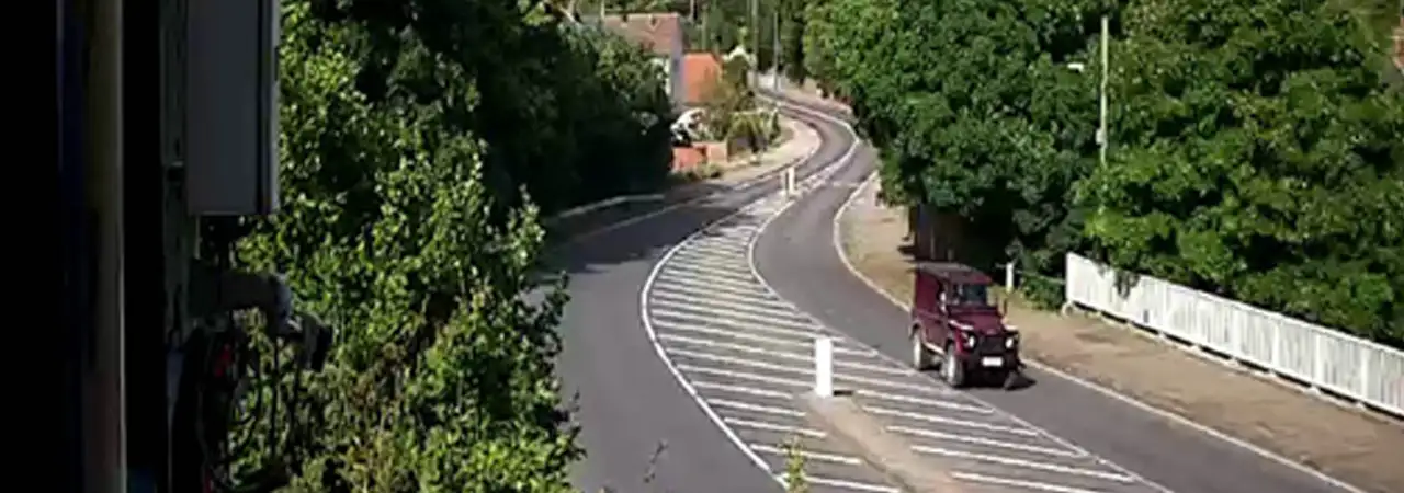
Mounted next to the radar is a camera. Below is an image from the camera that was taken at approximately the same time the radar data was captured.
import matplotlib.image as mpimg

# Load camera image.
camera_image = mpimg.imread('image.jpg')


def plot_camera(ax):
    """Display camera image on specified axis."""
    ax.imshow(camera_image)
    ax.set_title("Camera Output")
    ax.get_xaxis().set_ticks([])
    ax.get_yaxis().set_ticks([])


camera_fig, camera_ax = plt.subplots()
plot_camera(camera_ax)
Camera Output
Signal Processing
We have a one-dimensional complex time-domain signal, which we are going to convert into a frequency-domain representation as this is a more convenient format. The code below:
- extracts the signal associated with the part of each RRI that we are interested in,
- splits the signal into the parts associated with each spoke,
- converts the signal into a frequency domain representation, and
- discards the negative range bins.
The radar electronically scans from left to right. We are only interested in the return from the radar whilst it is performing this scan, i.e. during the up-ramp. We therefore keep the majority of the samples associated with the up-ramp and discard the remainder. Most of the samples that get discarded are the returns from the radar that occur whilst the radar is quickly moving the main lobe back to the starting position.
We know where the main lobe of the radar is pointing as this is related to the transmit frequency. We have chosen to split the radar’s field of view into 19 spokes. We split the time-domain signal up, assigning each sample to one of these spokes.
The previous two steps have really been about getting the time-domain signal into the correct format to use the Fast Fourier Transform (FFT). The FFT is used to convert our time-domain representation of the radar signal into a frequency-domain representation. The FFT is performed along the last two dimensions of windowed_spoke_data, a 3D array of time-domain data that has been windowed to reduce aliasing. In the code below, this FFT operation is performed in a single call to the fft2() function, as this is efficient.
fft_output now contains a frequency domain representation of the radar signal. One of the dimensions of fft_output is for the range bin. This will be discussed in more detail in the next section, but for now I am going to discard the negative range bins as we don’t need them.
# More constants.

# We need to skip the down-ramp and the beginning of the up ramp.
N_START = 2750
# The number of samples per spoke. It's the same as the number of
# range bins because this is the number of points in the FFT for
# this dimension.
N_R = 512
# The number of non-negative range bins.
N_PR = N_R // 2
# The number of spokes.
N_S = 19
# The number of Doppler bins.
N_D = 64
# Reshape the raw data to have 1 row of data for each ramp.
ramps = np.reshape(raw_data, (N_D, NUM_SAMPLES_PER_RAMP))
# Extract desired data for each ramp.
clean_ramps = ramps[:, N_START:(N_START + (N_S * N_R))]
# Reshape the ramp data to split it into each spoke.
spoke_data = np.reshape(clean_ramps, (N_D, N_S, N_R))
# We want the data to be an N_S by N_D by N_R array.
spoke_data = np.moveaxis(spoke_data, [0, 1, 2], [1, 0, 2])
# Window the data (reduce aliasing)
range_window = np.hanning(N_R)
doppler_window = np.hanning(N_D)
single_spoke_window = np.outer(doppler_window, range_window)
all_spokes_window = np.tile(single_spoke_window, (N_S, 1, 1))
windowed_spoke_data = all_spokes_window * spoke_data
# Perform a 2D FFT on the time-domain signal for each spoke.
fft_output = np.fft.fft2(windowed_spoke_data)
# Discard the negative range bins.
rda_map = fft_output[:, :, 0:N_PR]The Range-Doppler-Azimuth Map
In the previous section we transformed a time-domain representation of the radar return into a frequency-domain representation. We re-arranged the data prior to using the fft2() function, which means the output from it is a range-Doppler-azimuth map. This is a very useful representation of the returns received by the radar.
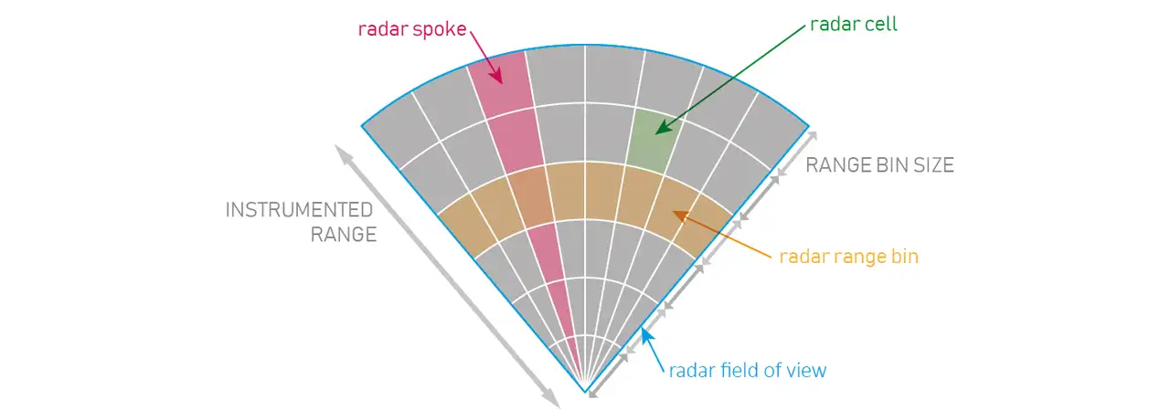
In the example code, the range-Doppler-azimuth map (rda_map) is a 19 by 64 by 256 array containing complex floating-point numbers. Each element encodes amplitude as the magnitude of the number and phase as the complex angle of the number. The first and last dimension are for azimuth and range, respectively. This is the radar’s field of view in a polar coordinate system. Each of the 19 spokes are divided into 256 range bins. All the elements in rda_map with the same spoke and range index are radar returns from the same region of the radar’s field of view, also known as a radar cell. For example, rda_map[0, :, 255] is the set of radar returns for the most distant range bin in the left-most spoke.
We have a set of returns for each radar cell due to Doppler. Thanks to the use of multiple RRIs in a frame of data, we can determine the radial velocity of returns. Just like with the other dimensions of the range-Doppler-azimuth map, radial velocities are grouped into Doppler bins. In our case, the first Doppler bin index (0) is for returns from stationary (and nearly stationary) objects, Doppler bins with indices 1-31 are for positive radial velocities (moving away from the radar), and remaining Doppler bins are for negative radial velocities (moving towards the radar). For a fixed RRI duration, the Doppler resolution increases proportionally as ND increases.
It should be noted that radars have a maximum unambiguous velocity. Where there is a return from an object that exceeds this radial velocity, the Doppler bin index will wrap around using modulo arithmetic. This means that sometimes we cannot use only the Doppler bin index from a single frame of data to determine the radial velocity of an object. We can overcome this ambiguity by using multiple transmit waveforms with different maximum unambiguous velocities. Alternatively, we could observe the object over multiple frames to estimate its kinematic state.
Visualisation
We need to find a way to visualise a three-dimensional array of complex numbers. How you do this depends on what you want to see. I am going to provide three example visualisations, all of which utilise the magnitude of the radar return.
B-Scope
A B-Scope provides a 2D view of the radar returns as range and azimuth vary. In our example, azimuth varies along the x-axis and range varies along the y-axis. We have removed the Doppler dimension of the range-Doppler-azimuth map by taking the maximum magnitude of the radar returns over the set of Doppler bins for each range-azimuth cell. The use of a logarithmic scale makes it easier to see a much wider range of radar return magnitudes, the use of a linear scale with a very strong return can make all of the other returns hard to see.
Discarding all but the maximum magnitude can be a good approach if the returns of interest are stronger than the background noise and each return tends to be in a small number of elements of the range-Doppler-azimuth map. This is where the number of Doppler bins, the integration time, is important. Too large a value for ND can result in the returns from a single object smearing across multiple elements of the range-Doppler-azimuth map, e.g. as it moves between range bins over the duration of a single frame. Too small a value for ND can reduce the signal-to-noise ratio, making it harder to see objects of interest.
The code below shows an example of how the range-Doppler map can be transformed into a B-Scope plot. Colour is used to indicate the magnitude of the radar return.
from matplotlib import colors

# All visualisations will use the magnitude of the complex radar
# returns.
abs_rda_map = np.abs(rda_map)  # Linear units.

# Visualise the log magnitude of the radar returns.
abs_rda_map_db = 10 * np.log10(abs_rda_map)

# Flatten the data cube by using the maximum of the Doppler bins for
# each range-azimuth cell. This is a range-azimuth map, an N_S by
# N_PR array of real numbers.
ra_map = np.amax(abs_rda_map_db, 1)

# Beamwidth of each spoke (degrees).
SPOKE_RES_DEG = 1.8
SPOKE_RES_RAD = np.deg2rad(SPOKE_RES_DEG)

# Range resolution (metres).
RANGE_RES = 0.60

# The field of view of the radar.
MAX_AZ_DEG = (N_S * SPOKE_RES_DEG) / 2
MIN_AZ_DEG = -MAX_AZ_DEG
MIN_RANGE = 0
MAX_RANGE = N_PR * RANGE_RES

# The range of radar return magnitudes to visualise.
# An arbitrarily chosen range where the minimum has been increased
# to make the plots look clearer.
MIN_RETURN = 0
MAX_RETURN = 20
vis_norm = colors.Normalize(MIN_RETURN, MAX_RETURN)


# B-scope plot.
def plot_b_scope(ax):
    """B-Scope plot on specified axis."""
    im = ax.imshow(
        ra_map.transpose(),
        aspect="auto",
        origin="lower",
        extent=(MIN_AZ_DEG, MAX_AZ_DEG, MIN_RANGE, MAX_RANGE),
        norm=vis_norm,
    )
    ax.set_title("B-Scope")
    ax.set_xlabel("Azimuth (degrees)")
    ax.set_ylabel("Range (m)")
    return im


b_scope_fig, b_scope_ax = plt.subplots()
im = plot_b_scope(b_scope_ax)
b_scope_ax.set_aspect(0.75)
b_scope_fig.colorbar(im, ax=b_scope_ax);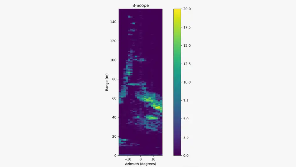
Plan Position Indicator Plot
A traditional Plan Position Indicator (PPI) plot puts the radar in the centre of a polar coordinate system. It provides a range vs. bearing view of radar returns for the entire 360-degree region surrounding the radar. Since our radar has a smaller field of view, we’re going to provide a sector of that 360-degree view. We transform our B-Scope plot by reshaping the rectangular plot to fit into a sector. The transformation results in a plan view of the radar returns, where the view is now a scaled version of the radar’s actual field of view.
The code below shows an example of creating a PPI plot. The ra_map variable, our range-azimuth map, used to create the B-Scope plot. A mesh is created, where a trapezium is used to approximate each range-azimuth cell. As with the B-Scope plot, the colour of each range-azimuth cell is used to show the maximum radar return from all of the Doppler bins with that cell.
min_az_rad = np.deg2rad(MIN_AZ_DEG)
max_az_rad = np.deg2rad(MAX_AZ_DEG)
# Create a grid of vertices that approximate the bounds of each
# radar cell (in polar coordinates).
r, az = np.mgrid[
    MIN_RANGE:MAX_RANGE:(1j * (N_PR + 1)),
    min_az_rad:(max_az_rad + SPOKE_RES_RAD):SPOKE_RES_RAD
]
# Convert polar to Cartesian coordinates.
grid_x = r * np.cos(az + (np.pi / 2))
grid_y = r * np.sin(az + (np.pi / 2))


def plot_ppi(ax, data, plot_name, norm=None):
    """PPI plot on specified axis.

    Uses a pcolormesh to create a PPI plot.

    Args:
        ax: Axis to use for plotting.
        data: Range-azimuth map to plot.
        plot_name: Title for the plot.
        norm: Optional object for normalising data.

    Returns:
        The QuadMesh returned by pcolormesh.
    """
    # pcolormesh() expects the y axis on first dimension and the
    # x-axis on the second dimension.We need to rotate the matrix
    # anti-clockwise by 90 degrees to match this.
    rotated = np.rot90(data, 3)
    mesh = ax.pcolormesh(grid_x, grid_y, rotated, norm=norm)
    ax.set_title(plot_name)
    ax.set_xlabel("Cross-range (m)")
    ax.set_ylabel("Down-range (m)")
    ax.set_aspect("equal")
    return mesh


ppi_fig, ppi_ax = plt.subplots()
ppi_mesh = plot_ppi(ppi_ax, ra_map, "PPI Plot", norm=vis_norm)
ppi_fig.colorbar(ppi_mesh, ax=ppi_ax);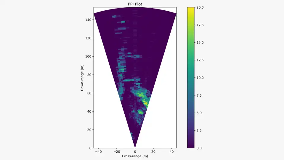
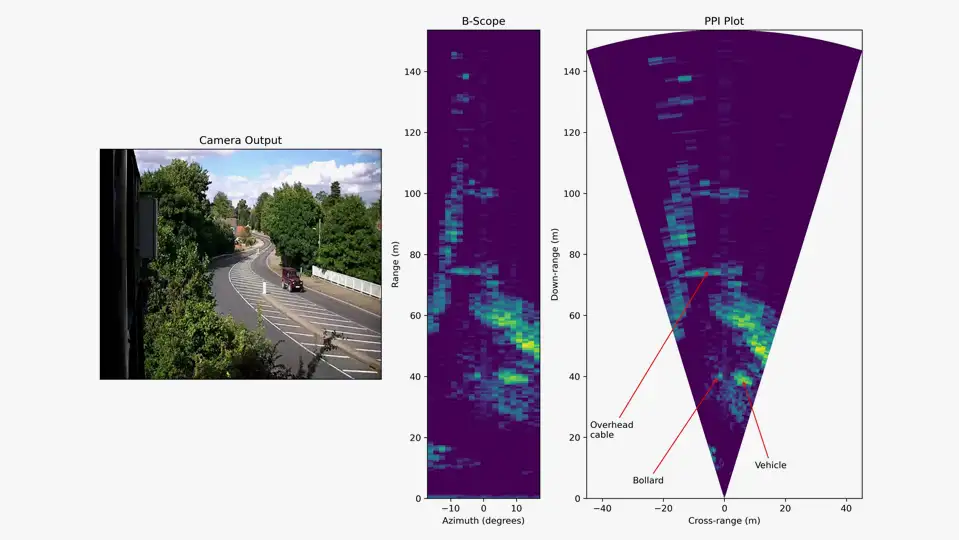
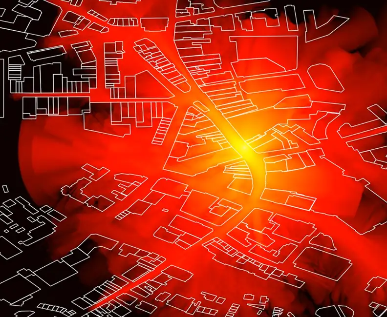
The code and visualisation below provide a comparison of the B-Scope and PPI plots using the same frame of radar data, alongside the corresponding image from the co-located camera. The B-Scope and PPI plots use the same range-Doppler-azimuth map and use the same colour map to show the magnitude of the radar returns. The area of a range-azimuth cell increases with the distance from the radar, this can be seen in the PPI plot.
The camera provides a good view of the scene. It is easy to detect larger objects that are relatively close to the camera, e.g. the vehicle and the railings. This might not be true in conditions where there is poor visibility, e.g. darkness or fog. It is also harder to spot smaller objects in the scene, for example overhead cables. Radar is a great complementary sensing modality. Radar performance does not degrade at night. Weather can reduce the performance of some radars, and whilst there is an increase in signal attenuation as water content increases, this radar performs well in bad weather. Radars can be used to detect small objects that cameras can’t. In this example, the radar receives returns from an overhead cable that isn’t visible in the photo. Plextek have developed a radar that can detect small debris on runways.
# Let's compare the image with the B-scope and PPI visualisations.
# Supply the subplots() function with width ratios to make the
# scale of the ranges in the B-Scope and PPI plots approximately
# equal.
gs_kw = {"width_ratios": [1, 0.4, 1]}
compare_fig, compare_axes = plt.subplots(
    1,
    3,
    constrained_layout=<span style="color: #339966;">True</span>,
    gridspec_kw=gs_kw,
)
plot_camera(compare_axes[0])
plot_b_scope(compare_axes[1])
plot_ppi(compare_axes[2], ra_map, "PPI Plot", norm=vis_norm)

# Add annotations to the PPI plot for where I think objects are.
arrow_props2 = {"arrowstyle": "->", "color": "r"}
# Plastic bollard.
compare_axes[2].annotate(
    "Bollard",
    xy=(-2, 40),
    xytext=(-30, 5),
    arrowprops=arrow_props2,
)
# Vehicle.
compare_axes[2].annotate(
    "Vehicle",
    xy=(6, 39),
    xytext=(10, 10),
    arrowprops=arrow_props2,
)
# Overhead cable.
compare_axes[2].annotate(
    "Overhead\ncable",
    xy=(-5, 75),
    xytext=(-44, 20),
    arrowprops=arrow_props2,
);
Doppler
The visualisations provided so far don’t distinguish between static and moving objects and so they don’t really illustrate one of the great aspects of radar. Doppler information can provide a valuable means of distinguishing between things of interest and clutter. We can use the Doppler information contained in the range-Doppler-azimuth map to detect moving objects.
The code below visualises the range-Doppler map for the one of the spokes that includes returns from the vehicle. The Doppler bin index is on the x-axis and the range is on the y-axis. The visualisation shows some strong returns near the Doppler bin 0, from stationary and nearly stationary objects. The return from the vehicle can be seen in multiple Doppler bins, this is to be expected since the vehicle consists of multiple moving parts that can reflect the signal from the radar, e.g. each wheel can provide a return in one or more Doppler bins that might be different to the returns from the main body of the vehicle.
# Visualise the range-Doppler map for the 15th spoke.
# Use linear units and a different colour map to make it clearer.
#
# Note: abs_rda_map is the range-Doppler-azimuth map, where each
# element is the magnitude of the radar return.
rd_map = abs_rda_map[14, :, :]
fig, ax = plt.subplots()
im = ax.imshow(
    rd_map.transpose(),
    origin="lower",
    extent=(1, N_D, MIN_RANGE, MAX_RANGE),
    cmap="Blues",
)
ax.set_title("Range-Doppler Map for a Single Spoke")
ax.set_xlabel("Doppler Bin Index")
ax.set_ylabel("Range (m)")
# Add annotation for the vehicle.
ax.annotate(
    "Vehicle",
    xy=(12, 39),
    xytext=(25, 80),
    arrowprops=arrow_props2,
);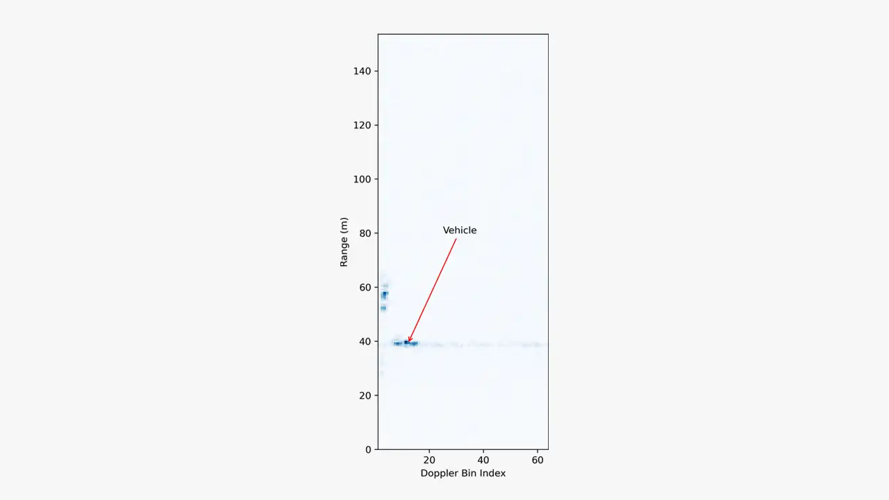
Range-Doppler Map for a Single Spoke
Hopefully, this has helped to introduce fellow programmers to processing imaging radar data. Once we have a range-Doppler-azimuth map, it’s largely about finding the appropriate processing and/or visualisation to make sense of it. This could be a simple PPI plot, or it could be a complex processing pipeline for detecting, tracking, and classifying objects for autonomous navigation.
Pioneering Advanced In-Orbit Servicing
Pioneering a ground-breaking collaboration in advanced in-orbit servicing, setting new benchmarks for space debris removal and satellite maintenance.

Evolving silicon choices in the AI age
How do you choose? We explore the complexities and evolution of processing silicon choices in the AI era, from CPUs and GPUs to the rise of TPUs and NPUs for efficient artificial intelligence model implementation.

SSL: The Revolution Will Not Be Supervised
Exploring the cutting-edge possibilities of Self-Supervised Learning (SSL) in machine learning architectures, revealing new potential for automatic feature learning without labelled datasets in niche and under-represented domains.

Unlocking the mysteries of imaging radar data processing
Looking deeper into the cutting edge of imaging radar data processing, where innovative techniques and practical applications combine to drive forward solutions.

Advancing space technology solutions through innovation
At the forefront of space technology innovation, we address complex engineering challenges in the sector, delivering low size, weight, and power solutions tailored for the harsh environment of space.
A Programmer’s Introduction to Processing Imaging Radar Data
A practical guide for programmers on processing imaging radar data, featuring example Python code and a detailed exploration of a millimetre-wave radar's data processing pipeline.

Folded Antennas; An Important Point of Clarification
Exploring the essential nuances of folded antennas, ensuring precision and clarity in this critical aspect of RF engineering and design.
Revolutionising chronic pain management
Fusing mmWave technology and healthcare innovation to devise a ground-breaking, non-invasive pain management solution, demonstrating our commitment to advancing healthtech.
Using Artificial Intelligence to Explore the Biological World
Harnessing AI's capabilities to decode protein folding, catalysing a leap in biological research and therapeutic innovation.

Artificial Intelligence in the Big and Scary Real World
Analysing the application of Artificial Intelligence in real-world scenarios, addressing its transformative potential and the ethical framework required for its deployment.

AI Gesture Control
Exploring the possibilities of AI gesture control for household appliances and more, using privacy-preserving radar technology, underscoring innovation in smart home interactions.

Giants and Small Antennas
Presenting the first documented numerical modelling of the historic Grimeton VLF antenna at the IEEE International Symposium on Antennas and Propagation, showcasing advancements in electrically small antennas.


Contact Us
Technology Platforms
Plextek's 'white-label' technology platforms allow you to accelerate product development, streamline efficiencies, and access our extensive R&D expertise to suit your project needs.
-
01 Configurable mmWave Radar Module
 Configurable mmWave Radar Module
Plextek’s PLX-T60 platform enables rapid development and deployment of custom mmWave radar solutions at scale and pace
-
02 Configurable IoT Framework
 Configurable IoT Framework
Plextek’s IoT framework enables rapid development and deployment of custom IoT solutions, particularly those requiring extended operation on battery power
-
03 Ubiquitous Radar
 Ubiquitous Radar
Plextek's Ubiquitous Radar will detect returns from many directions simultaneously and accurately, differentiating between drones and birds, and even determining the size and type of drone
Downloads
View All Downloads- PLX-T60 Configurable mmWave Radar Module
- PLX-U16 Ubiquitous Radar
- Configurable IOT Framework
- MISPEC
- Cost Effective mmWave Radar Devices
- Connected Autonomous Mobility
- Antenna Design Services
- Plextek Drone Sensor Solutions Persistent Situational Awareness for UAV & Counter UAV
- mmWave Sense & Avoid Radar for UAVs
- Exceptional technology to positive impact your marine operations
- Infrastructure Monitoring
Machine Learning for Rapid Propagation Assessment
Developing a groundbreaking ML model for swift and efficient coverage prediction in complex urban environments, enabling rapid optimisation of transmitter locations on standard computing hardware.
Read More
Cost-Effective Improvement in mmWave Intensity
Enhancing the mmWave antenna design for Remedee Labs, significantly boosting RF radiation efficiency and cost-effectiveness in non-pharmaceutical chronic pain treatment.
Read More
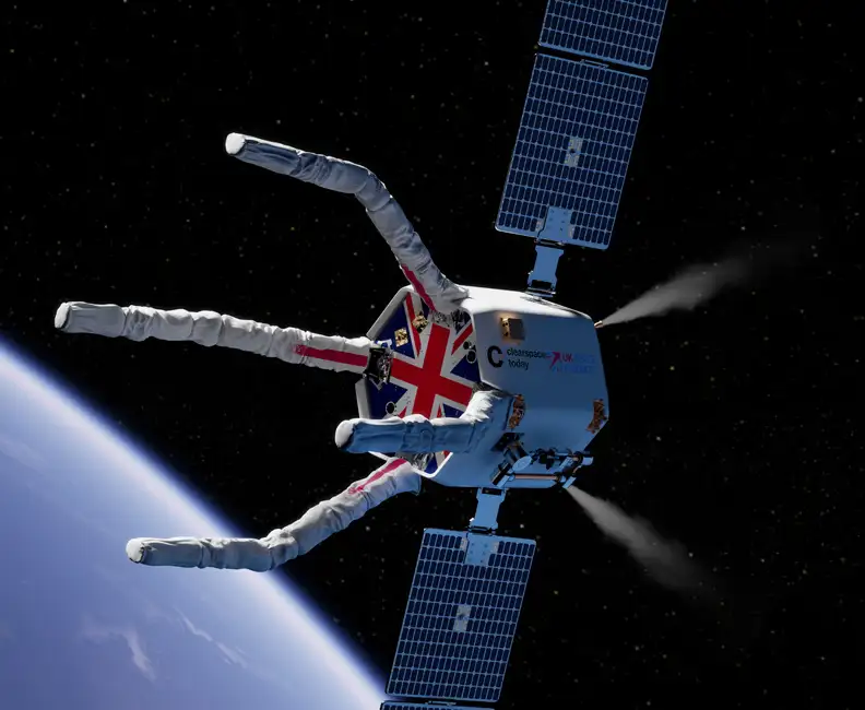
Game-Changing Radar for the CLEAR Mission
Developing vital radar technology for the CLEAR mission, advancing space debris removal techniques to safeguard operational satellites and spacecraft.
Read More
Future Sensing: Improving Mobile Ad-hoc Networks
Leading a transformative four-year research initiative to improve mobile ad-hoc networks through advanced directional antenna systems and cross-layer processing, significantly enhancing military communication capabilities.
Read More
Millimetre-Wave Radar System
Expertly engineering a compact, high-performance 60 GHz millimetre-wave radar system using innovative Substrate Integrated Waveguide technology, achieving significant advancements in target detection up to 100 metres.
Read More
Communicating Across Surfaces
Using innovative expertise in metamaterials to facilitate the development of advanced surfaces, improving RF communication efficiency through pioneering surface wave technology for superior antenna design and wireless connectivity.
Read More
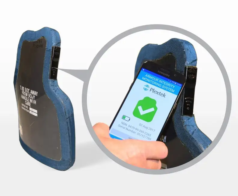
Armour Integrity Monitoring System (AIMS)
Innovating a new Armour Integrity Monitoring System (AIMS) for the UK MoD, delivering a low SWaP-C solution that dramatically streamlines logistics and enhances protection through in-field armour integrity checks.
Read More
mmWave Radar for Foreign Object Debris Detection
Collaborating with WaveTech to develop an advanced mmWave radar system, enabling the rapid and automated detection of foreign object debris on runways, enhancing safety and operational efficiency at a South Korean airport.
Read More

Spinbrush: From Insights to Strategy to Design
Discover how we enabled Spinbrush to leverage consumer insights to innovate and excel in the competitive powered toothbrush market with our strategic approach.
Read More

Energenie Smart Home Controller
Redesigning the Energenie Smart Home Controller interface to introduce low-power radio technology, enhancing device functionality for centralised home heating control, and launching nationwide.
Read More
Developing Automated Manufacturing Systems
Delivering a pioneering predictive maintenance solution for a global healthcare product company, utilising miniature battery-powered sensor systems to optimise automated production lines and significantly reduce costly downtimes.
Read More
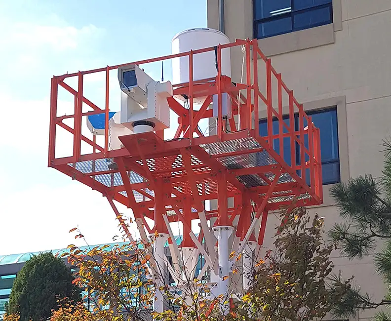
Surveillance Radar for Comprehensive Threat Detection
Advancing a perimeter surveillance solution with long-range detection and low false-alarm rates, using state-of-the-art Passive Electronically Scanned Array technology for robust and maintenance-free operation in a range of demanding environments.
Read More
mmWave Imaging Radar
Camera systems are in widespread use as sensors that provide information about the surrounding environment. But this can struggle with image interpretation in complex scenarios. In contrast, mmWave radar technology offers a more straightforward view of the geometry and motion of objects, making it valuable for applications like autonomous vehicles, where radar aids in mapping surroundings and detecting obstacles. Radar’s ability to provide direct 3D location data and motion detection through Doppler effects is advantageous, though traditionally expensive and bulky. Advances in SiGe device integration are producing more compact and cost-effective radar solutions. Plextek aims to develop mm-wave radar prototypes that balance cost, size, weight, power, and real-time data processing for diverse applications, including autonomous vehicles, human-computer interfaces, transport systems, and building security.
Low Cost Millimeter Wave Radio frequency Sensors
This paper presents a range of novel low-cost millimeter-wave radio-frequency sensors that have been developed using the latest advances in commercially available electronic chip-sets. The recent emergence of low-cost, single chip silicon germanium transceiver modules combined with license exempt usage bands is creating a new area in which sensors can be developed. Three example systems using this technology are discussed, including: gas spectroscopy at stand off distances, non-invasive dielectric material characterization and high performance micro radar.
Metamaterial-Based Ku-Band Flat-Panel High-Grain
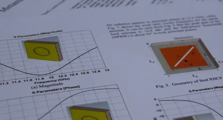
This technical paper by Dr. Rabbani and his team presents research on metamaterial-based, high-gain, flat-panel antennas for Ku-band satellite communications. The study focuses on leveraging the unique electromagnetic properties of metamaterials to enhance the performance of flat-panel antenna designs, aiming for compact structures with high gain and efficiency. The research outlines the design methodology involving multi-layer metasurfaces and leaky-wave antennas to achieve a compact antenna system with a realised gain greater than +20 dBi and an operational bandwidth of 200 MHz. Simulations results confirm the antenna's high efficiency and performance within the specified Ku-band frequency range. Significant findings include the antenna's potential for application in low-cost satellite communication systems and its capabilities for THz spectrum operations through design modifications. The paper provides a detailed technical roadmap of the design process, supported by diagrams, simulation results, and references to prior work in the field. This paper contributes to the advancement of antenna technology and metamaterial applications in satellite communications, offering valuable insights for researchers and professionals in telecommunications.
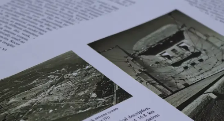
The Kootwijk VLF Antenna: A Numerical Model
A comprehensive analysis of the historical Kootwijk VLF (Very Low Frequency, which covers 3-30 kHz) antenna, including the development of a numerical model to gain insight into its operation. The Kootwijk VLF antenna played a significant role in long-range communication during the early 20th century. The paper addresses the challenge of accurately modelling this electrically small antenna due to limited historical technical information and its complex design. The main goal is to understand if the antenna’s radiation efficiency might explain why “results were disappointing” for the Kootwijk to Malabar (Indonesia) communications link. Through simulations and comparisons with historical records, the numerical model reveals that the Kootwijk VLF antenna had a low radiation efficiency – about 8.9% – for such a long-distance link. This work discusses additional loss mechanisms in the antenna system that might not have been considered previously, including increased transmission-line losses as a result of impedance mismatch, wires having a lower effective conductivity than copper and inductor quality factors being lower than expected. The study provides insights into key antenna parameters, such as the radiation pattern, the antenna’s quality factor, half-power bandwidth and effective height, as well as the radiated power level and the power lost through dissipation. This research presents the first documented numerical analysis of the Kootwijk VLF antenna and contributes to a better understanding of its historical performance. While the focus has been at VLF, this work can aid future modelling efforts for electrically small antennas at other frequency bands.
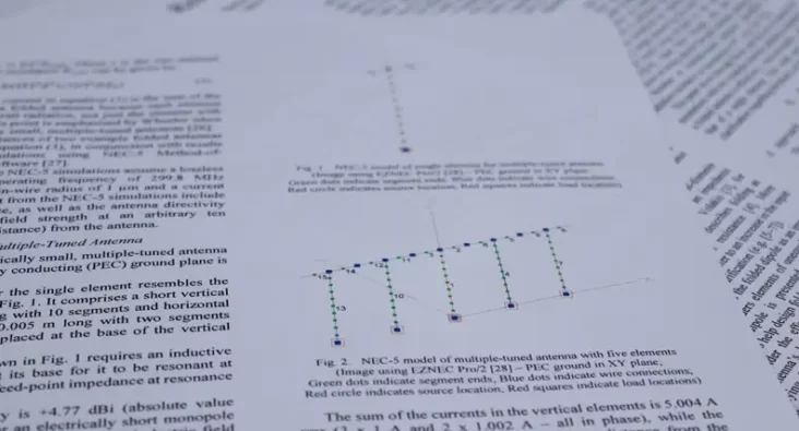
On the Radiation Resistance of Folded Antennas
This technical paper highlights the ambiguity in the antenna technical literature regarding the radiation resistance of folded antennas, such as the half-wave folded dipole (or quarter-wave folded monopole), electrically small self-resonant folded antennas and multiple-tuned antennas. The feed-point impedance of a folded antenna is increased over that of a single-element antenna but does this increase equate to an increase in the antenna’s radiation resistance or does the radiation resistance remain effectively the same and the increase in feed-point impedance is due to transformer action? Through theoretical analysis and numerical simulations, this study shows that the radiation resistance of a folded antenna is effectively the same as its single-element counterpart. This technical paper serves as an important point of clarification in the field of folded antennas. It also showcases Plextek's expertise in antenna theory and technologies. Practitioners in the antenna design field will find valuable information in this paper, contributing to a deeper understanding of folded antennas.

Analysis of Chilton Ionosonde Critical Frequency Measurements During Solar Cycle 23 in the Context of Midlatitude HF NVIS Frequency Predictions
This paper presents a comparison of Chilton ionosonde critical frequency measurements against vertical-incidence HF propagation predictions using ASAPS (Advanced Stand Alone Prediction System) and VOACAP (Voice of America Coverage Analysis Program). This analysis covers the time period from 1996 to 2010 (thereby covering solar cycle 23) and was carried out in the context of UK-centric near-vertical incidence skywave (NVIS) frequency predictions. Measured and predicted monthly median frequencies are compared, as are the upper and lower decile frequencies (10% and 90% respectively). The ASAPS basic MUF predictions generally agree with fxI (in lieu of fxF2) measurements, whereas those for VOACAP appear to be conservative for the Chilton ionosonde, particularly around solar maximum. Below ~4 MHz during winter nights around solar minimum, both ASAPS and VOACAP MUF predictions tend towards foF2, which is contrary to their underlying theory and requires further investigation. While VOACAP has greater errors at solar maximum, those for ASAPS increase at low or negative T-index values. Finally, VOACAP errors might be large when T-SSN exceeds ~15.
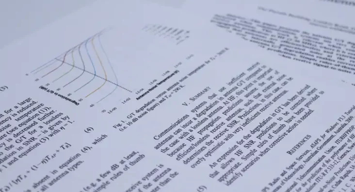
Antenna GT Degradation with Inefficient Receive Antenna at HF
This paper presents the antenna G/T degradation incurred when communications systems use very inefficient receive antennas. This work is relevant when considering propagation predictions at HF (2-30 MHz), where it is commonly assumed that antennas are efficient/lossless and external noise dominates over internally generated noise at the receiver. Knowledge of the antenna G/T degradation enables correction of potentially optimistic HF predictions. Simple rules of-thumb are provided to identify scenarios when receive signal-to-noise ratios might be degraded.
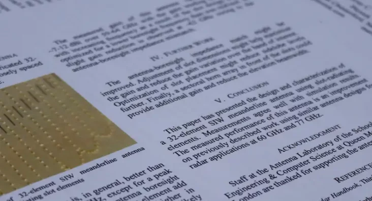
Frequency-Scanning Substrate-Integrated-Waveguide Meanderline Antenna for Radar Applications at 60GHz
This paper describes the design and characterization of a frequency-scanning meanderline antenna for operation at 60 GHz. The design incorporates SIW techniques and slot radiating elements. The amplitude profile across the antenna aperture has been weighted to reduce sidelobe levels, which makes the design attractive for radar applications. Measured performance agrees with simulations, and the achieved beam profile and sidelobe levels are better than previously documented frequency-scanning designs at V and W bands.
Comparison of Propagation Predictions and measurements for midlatitude High Frequency
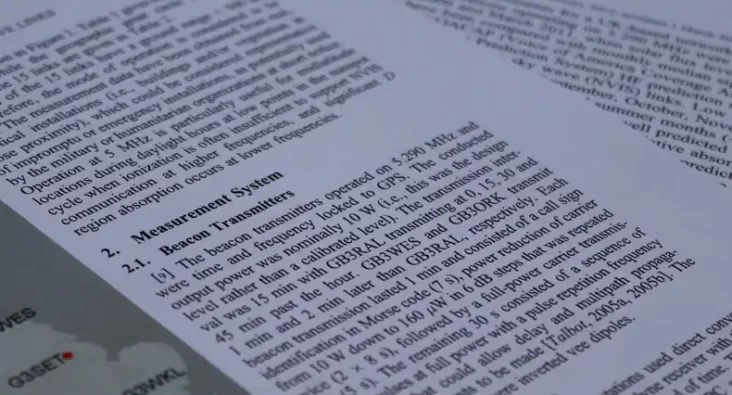
Signal power measurements for a UK-based network of three beacon transmitters and five receiving stations operating on 5.290 MHz were taken over a 23 month period between May 2009 and March 2011, when solar flux levels were low. The median signal levels have been compared with monthly median signal level predictions generated using VOACAP (Voice of America Coverage Analysis Program) and ASAPS (Advanced Stand Alone Prediction System) HF prediction software with the emphasis on the near-vertical incidence sky wave (NVIS) links. Low RMS differences between measurements and predictions for September, October, November, and also March were observed. However, during the spring and summer months (April to August), greater RMS differences were observed that were not well predicted by VOACAP and ASAPS and are attributed to sporadic E and, possibly, deviative absorption influences. Similarly,the measurements showed greater attenuation than was predicted for December, January, and February, consistent with the anomalously high absorption associated with the “winter anomaly.” The summer RMS differences were generally lower for VOACAP than for ASAPS. Conversely, those for ASAPS were lower during the winter for the NVIS links considered in this analysis at the recent low point of the solar cycle. It remains to be seen whether or not these trends in predicted and measured signal levels on 5.290 MHz continue to be observed through the complete solar cycle.
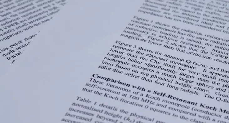
On using the classical monopole for comparison with other electrically small self-resonant monopole antennas of equal height
This paper shows that the Q-factor and VSWR of a monopole are significantly lowered when made resonant by reactive loading (as is used in practice). Comparison with a self-resonant Koch fractal monopole of equal height gives similar values of VSWR and Q-factor. Thus, the various electrically small monopoles (self-resonant and reactively loaded) offer comparable performance when ideal and lossless. However, in selecting the optimum design, conductor losses and mechanical construction at the frequency of interest must be considered. In essence, a trade-off is necessary to obtain an efficient, electrically small antenna suitable for the application in hand.
A Ku-Band, Low Sidelobe Waveguide Array Employing Radiating T Junctions
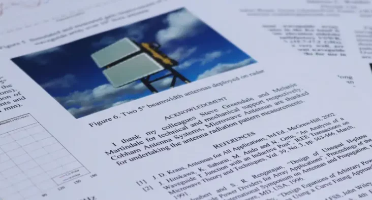
The design of a 16-element waveguide array employing radiating T-junctions that operates in the Ku band is described. Amplitude weighting results in low elevation sidelobe levels, while impedance matching provides a satisfactory VSWR, that are both achieved over a wide bandwidth (15.7-17.2 GHz). Simulation and measurement results, that agree very well, are presented. The design forms part of a 16 x 40 element waveguide array that achieves high gain and narrow beamwidths for use in an electronic-scanning radar system.
A Wideband, 5-50+GHz Tapered-Slot Antenna For Use in Handheld Test Equipment
A lightweight, wideband tapered-slot antenna that uses an antipodal Vivaldi design and provides useable gain from ~5 GHz to in excess of 50 GHz is described. Simulations and measurements are presented that show excellent agreement. This antenna design is currently deployed in handheld test equipment.